
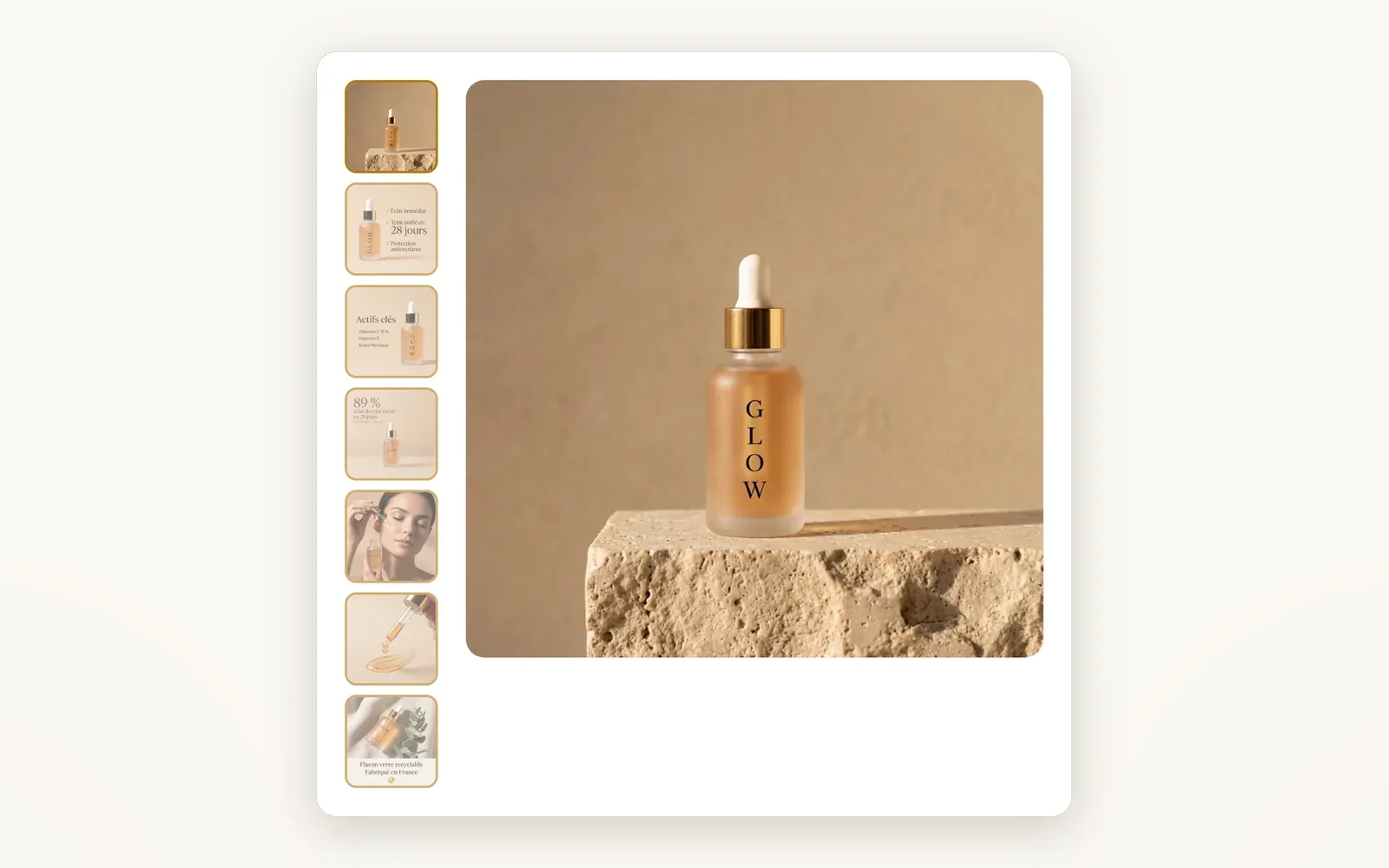
A gallery that shows off your product
8 desktop layouts, 7 on mobile, zoom on hover or fullscreen, and the image follows the selected variant.
What it does
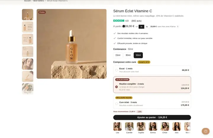
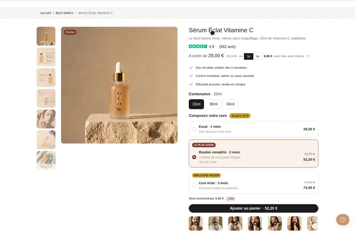
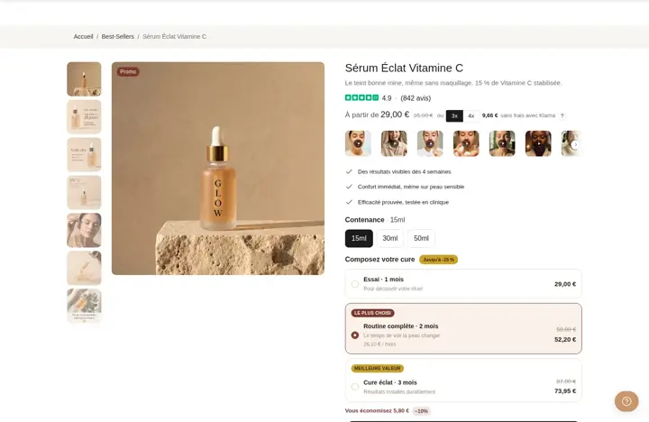
- Thumbnails on the left, right or bottom, grid, carousel or stacked images
- Zoom on hover or open in fullscreen (lightbox)
- Swaps the main image when the shopper picks a variant, with sale, sold out and new badges
What you can set
- Desktop layout
- Mobile layout
- Zoom behavior
- Swap main image on variant change
- Enable badges
- Arrows
Where to find it
Theme editor›Product template›Product page section›Product · media block
Left column: thumbnails on the left and main image
Related features
Your store deserves better than an empty theme.
Try Speedfly for 14 days on your real store. Not convinced? Cancel in one click.