
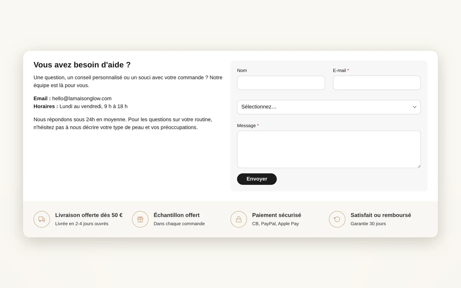
Multi-column: your custom-built grid
Create columns and rows, then drop in the blocks you want. Each column's width is adjustable on desktop and mobile.
What it does
- Each column accepts any theme block: heading, text, image, form...
- Column width in %, separately on desktop and on mobile
- Rows to stack several lines of columns in the same section
What you can set
- Column distribution
- Column vertical alignment
- Gap between columns · desktop
- Width · desktop
- Width · mobile
- Background color
Where to find it
Theme editor›Add section›Multi-column, then add Multi-column · column (or · row) blocks
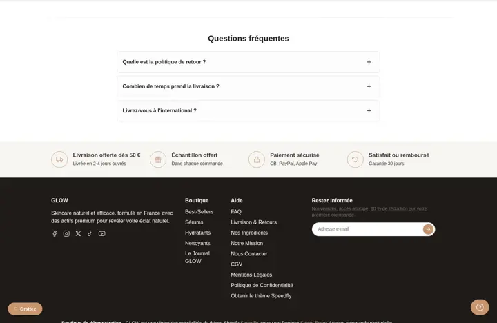
Two columns: "Vous avez besoin d'aide ?" text on the left, form on the right (and the trust bar in the footer)
Related features

Your store deserves better than an empty theme.
Try Speedfly for 14 days on your real store. Not convinced? Cancel in one click.