
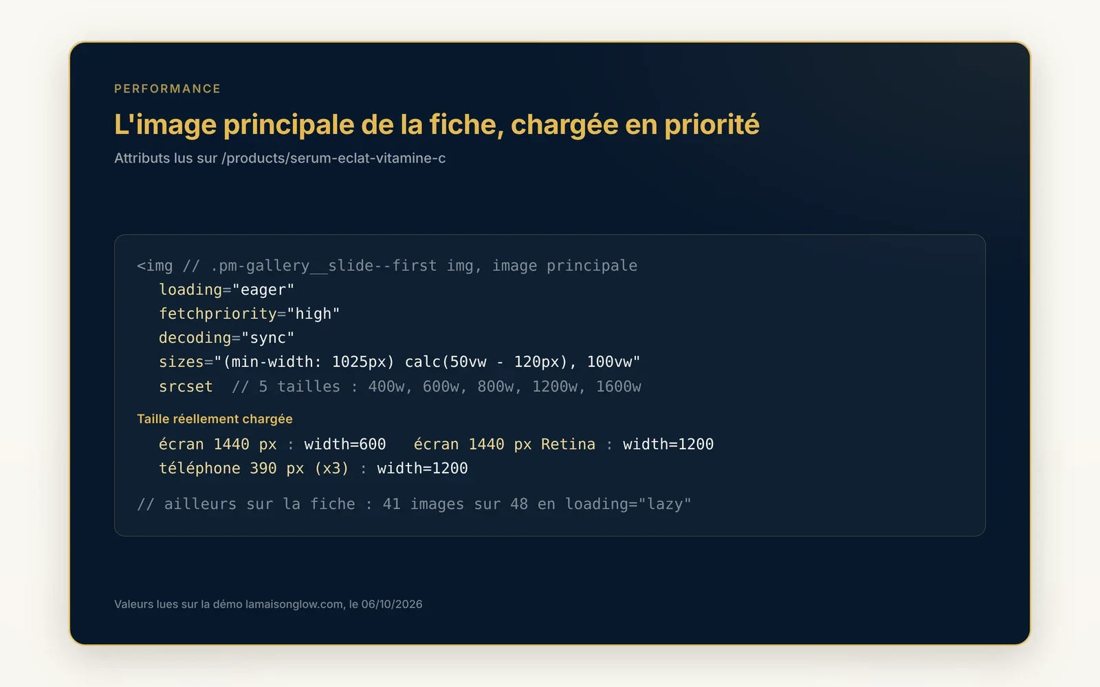
Images at the right size on every screen
Each image exists in several sizes: the phone loads the small one, the wide screen the large one, and the top image loads first.
What it does
- Up to 8 sizes per image, the browser picks the best fit
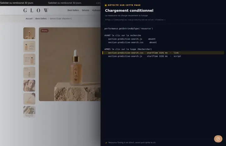
- Off-screen images load on scroll
- The main image at the top of the page is loaded with priority
What you can set
Nothing to set, it is automatic.
Where to find it
Automatic, nothing to turn on
Main product image (5 sizes, loaded first)
Related features
Your store deserves better than an empty theme.
Try Speedfly for 14 days on your real store. Not convinced? Cancel in one click.