
Features
111 features, fewer apps to stack.
Everything you need to sell, already in the theme. Filter by part of the store and open each feature to see what it does and where to set it.
Try it free for 14 daysUp to €84 of apps per month, included
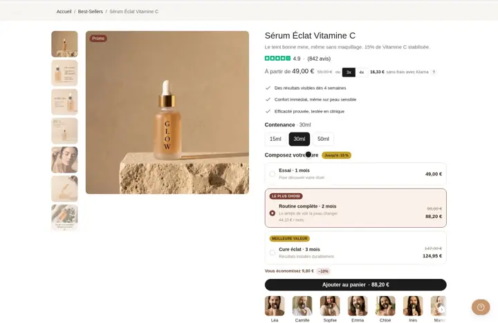 A gallery that shows off your product8 desktop layouts, 7 on mobile, zoom on hover or fullscreen, and the image follows the selected variant.
 Show your review rating under the titleStars and review count come from your review app through the Shopify metafield. Nothing to type in by hand.
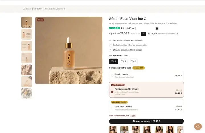
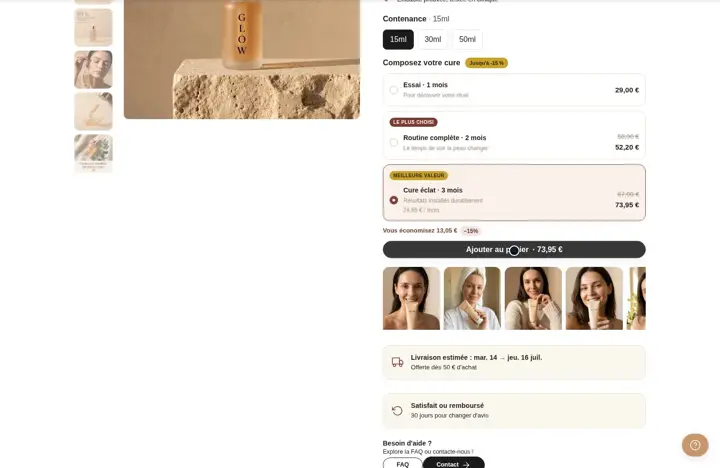 Sell in bundles with quantity offersOffer 1, 2 or 3 units with a compare-at price, per-unit price and badge. The shopper picks a bundle and adds it in one click.Save 17 €/mo
 Build product bundles to complete the orderThe shopper ticks the products that go with it, sees the total and the bundle discount, then adds everything to cart in one click.Save 15 €/mo
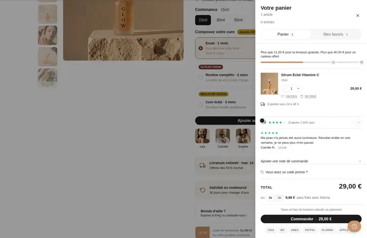 A cart drawer and a cart pagePick drawer, page or both. The shopper edits items, sees the total and goes to checkout without leaving the page.
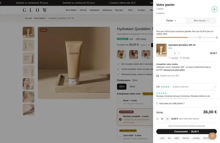 Add the blocks you want to the cartShipping bar, reviews, order note, gift wrap... You place each block before or after the line items.
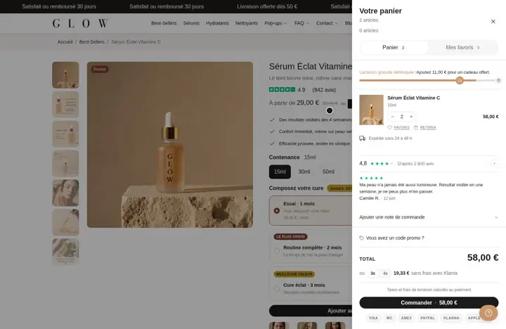 Show what's left to reach free shippingA bar fills up with each add to cart and shows what's left for free shipping, then for a gift added automatically.
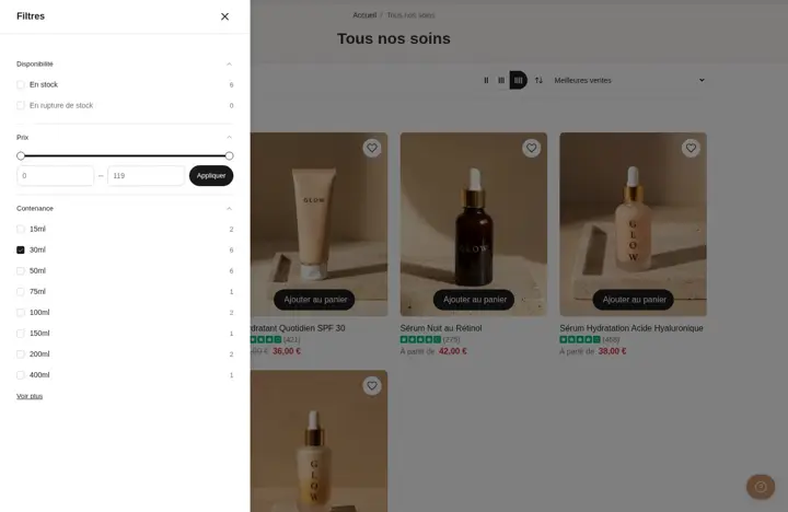 Filters that help shoppers find the right productSidebar, top bar, drawer or floating button. Filters come from Shopify's free Search & Discovery app.
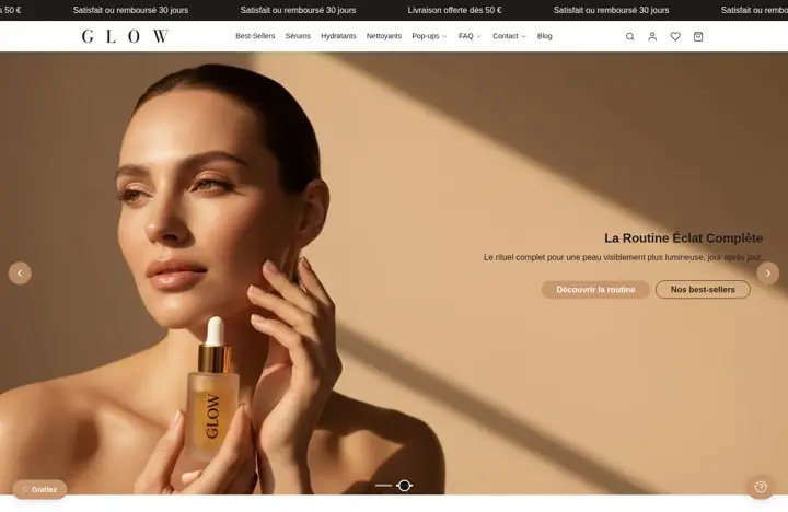 A homepage slideshow with images or video4 layouts, autoplay, fade or curtain transition, different image and video on mobile. Everything is set in the theme editor.
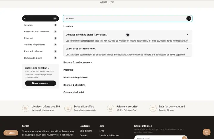 An FAQ with search and tabsYour questions sorted by category, a search bar, tabs and a card at the bottom so shoppers can contact you.
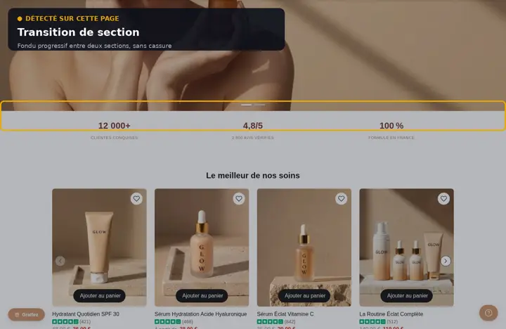 Smooth transitions between your sectionsWaves, arc, slant, gradient... 7 shapes to move from one section color to the next without a hard cut.
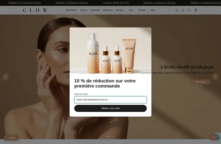 5 pop-ups that show up at the right momentNewsletter, wheel, scratch card, CTA and contact trigger on time, scroll, exit intent or cart value.
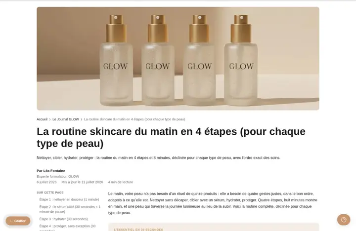 3 header styles for your articlesImage below the text, above it, or behind the title, with author, date and read time if you want.
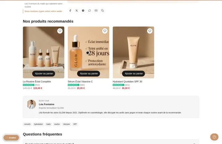 Sell the products mentioned in your articleYou link products to the article with a metafield and they show up in a grid, with add to cart.
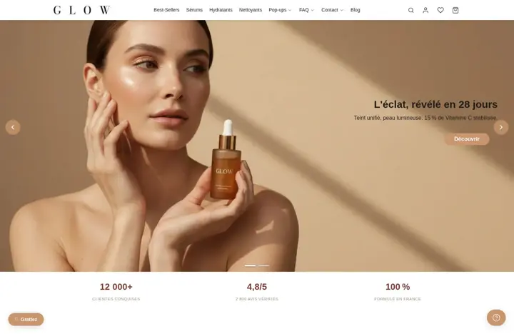 A custom-built header and footerYou stack rows and place logo, menu, search or text in columns. Each row can be hidden on mobile or desktop.
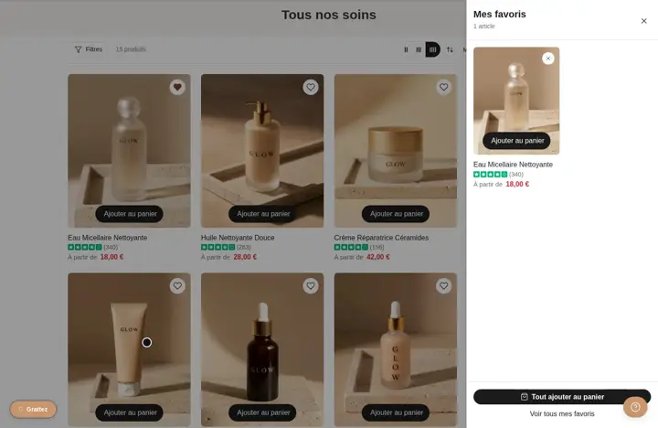 A wishlist for your customersA heart on product pages and cards, a wishlist drawer and page, with Add all to cart. Stored in the shopper's browser.Save 19 €/mo
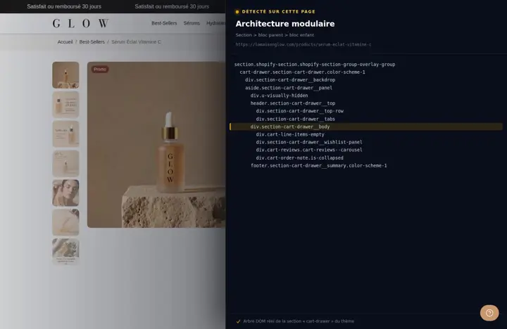 Each page loads only what it usesStyles and code are split by section and by component: a section that isn't on the page adds no file.
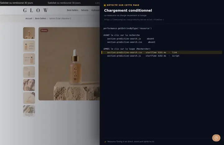 Search loads on the first clickThe JavaScript for the cart, search and mobile menu only loads when the shopper opens them.
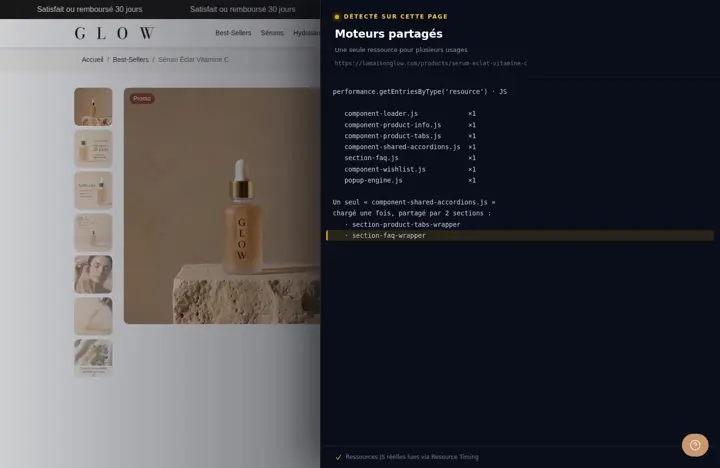 One engine for several sectionsAccordions and pop-ups each share a single code file, loaded once even when it's used in several places.
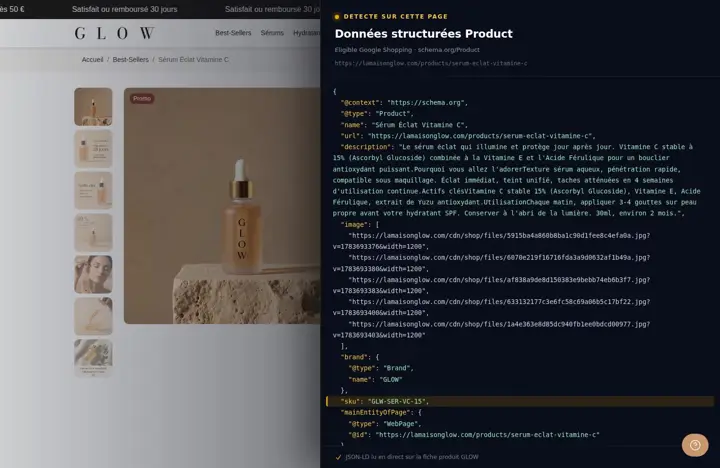 Product data that Google can readName, brand, SKU, price, stock and condition of each variant are sent to Google as structured data, with no app.
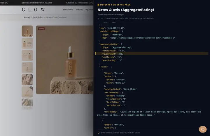 Your review rating passed on to GoogleThe theme reads the rating from Judge.me, Loox, Okendo, Yotpo, Stamped and others, and adds it to the product data. Google decides whether to show it.
 An llms.txt page for AI toolsA plain-text page template where you sum up your store, plus a link in the code of every page. A format that is still experimental.
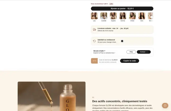 A 3rd column on the product pageA media, info and sidebar layout. For now, the sidebar only accepts app blocks.
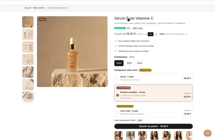 A product title with a tagline and subtitleAdd a word before or after the title (New, Best seller), a subtitle, and choose the H1 or H2 tag for SEO.
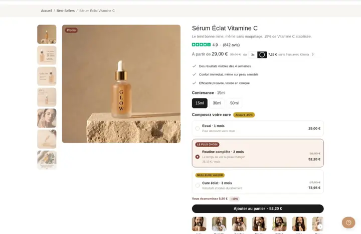 Compare-at price, savings and installmentsShows the amount or % saved and the price in 2, 3 or 4 installments. The actual installment payment stays with your provider.
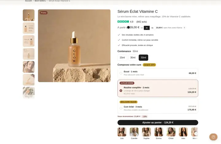 Clear variants, with a size chartPills, swatches or a dropdown for each option, stock status and a size chart in a pop-up or a drawer.
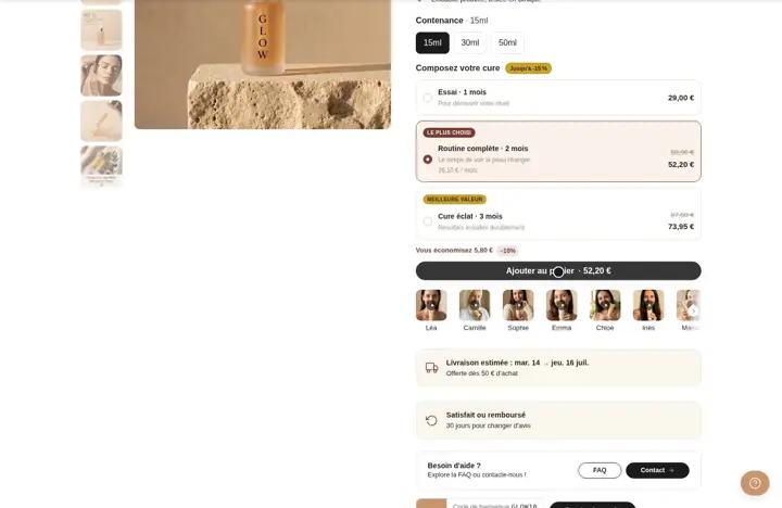 A complete buy button on the product pageQuantity inside the button, express checkout, wishlist heart, low-stock alert and an already-in-cart notice.
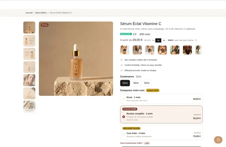 Short videos on your product pageA row of video thumbnails (demo, review, unboxing) that open large on click. Format, corner radius and badge are adjustable.
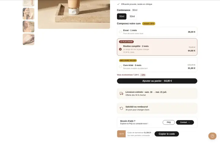
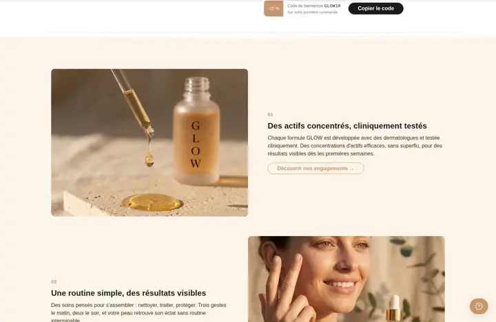
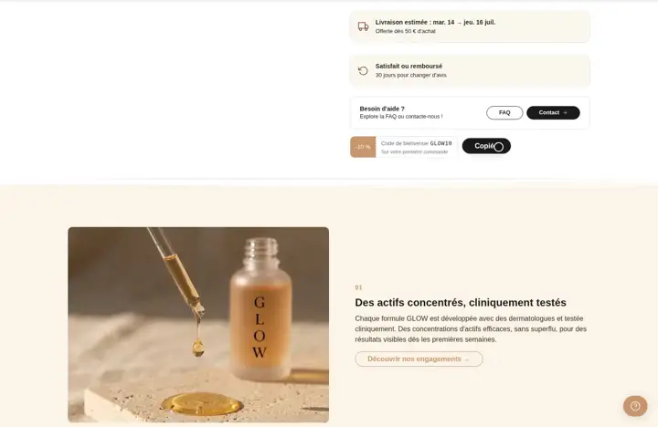 A promo code to copy on the product pageYour promo code under the buy button: the shopper copies it or applies it to the cart in one click. It disappears on the date you choose.
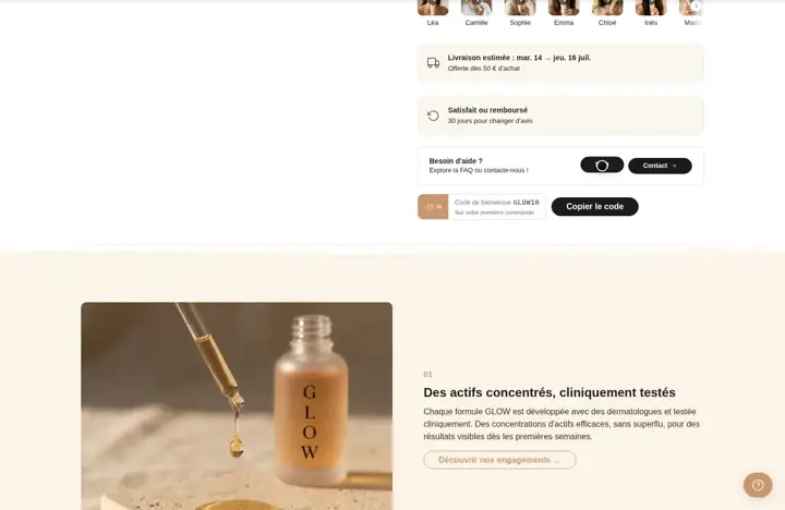 Reassure buyers with a help block on the product pageA "Need help?" box with two buttons (FAQ, contact, WhatsApp...) to answer the hesitant shopper before they leave.
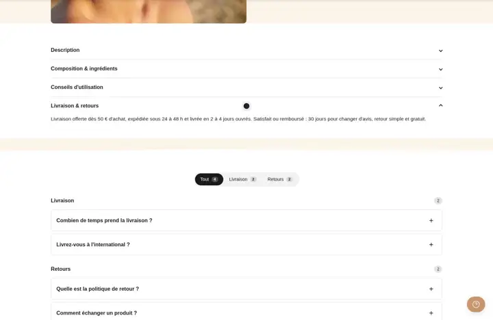 Organize product info into tabsPut description, shipping and care into tabs right next to the buy button. The page stays short and the info stays one click away.
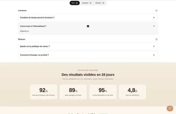 Collapsible product info that is easy to scanStack description, ingredients and shipping as collapsible rows under the buy button. Great on mobile, where tabs run out of room.
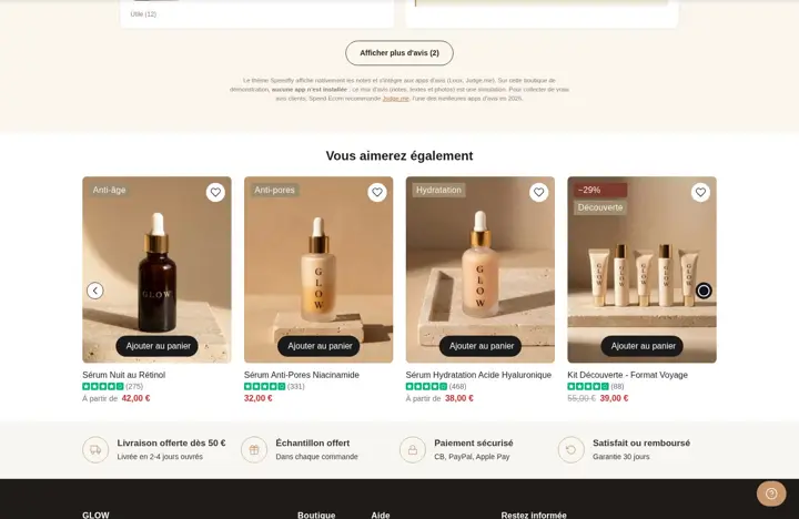 Recommended products under the product pageShopify picks related or complementary products and shows them under the product page. Otherwise, a fallback collection is shown.
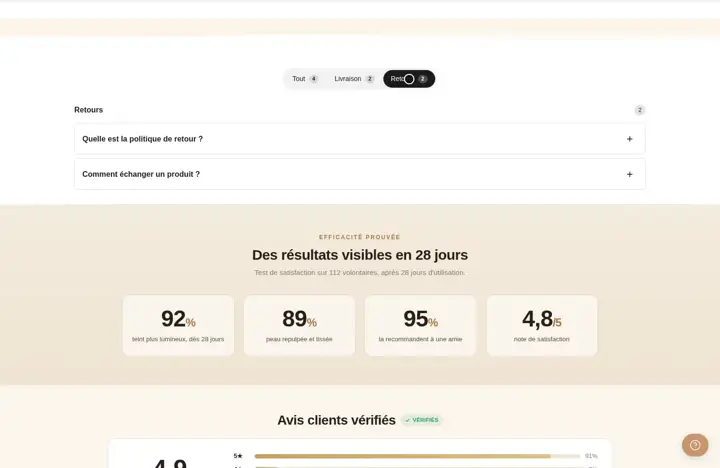 A large tabs section under the product pageA large tab area under the product page for long content: guide, ingredients, shipping. As tabs, a vertical rail or an accordion.
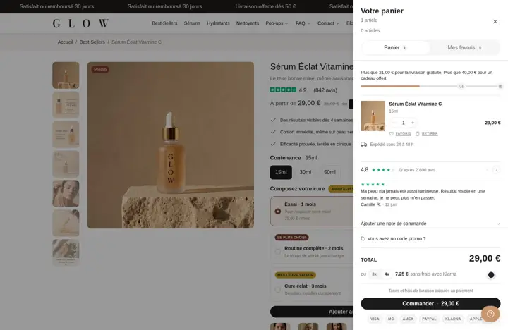 Pay in 3 or 4 installments shown in the cartUnder the total, the shopper sees the amount in 2, 3 or 4 installments with your provider's name. Useful if you already offer split payments.
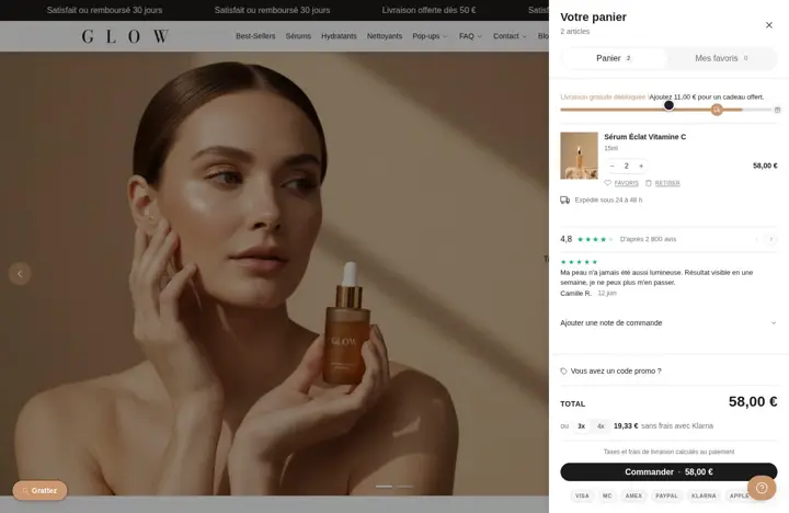 An announcement message at the top of the cartA banner at the top of the cart for a key message: shipping time, current code, guarantee. You write the text and pick the colors.
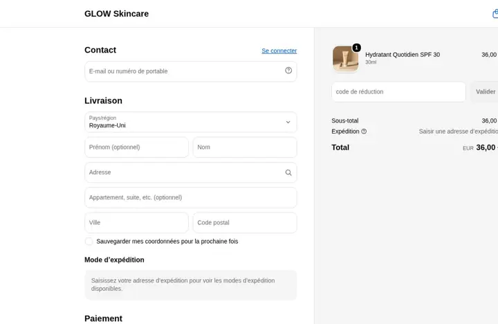 Checkout steps shown in the cartA "Cart › Shipping › Payment" marker at the top of the cart: the shopper sees only a few steps are left before ordering.
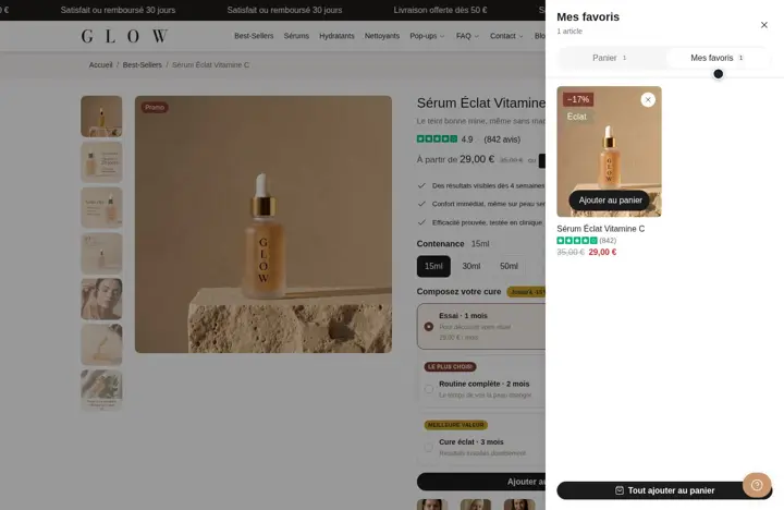 A Wishlist tab in the cart drawerThe cart drawer has two tabs: Cart and My wishlist. Shoppers find their favorites and add them to cart without leaving the page.
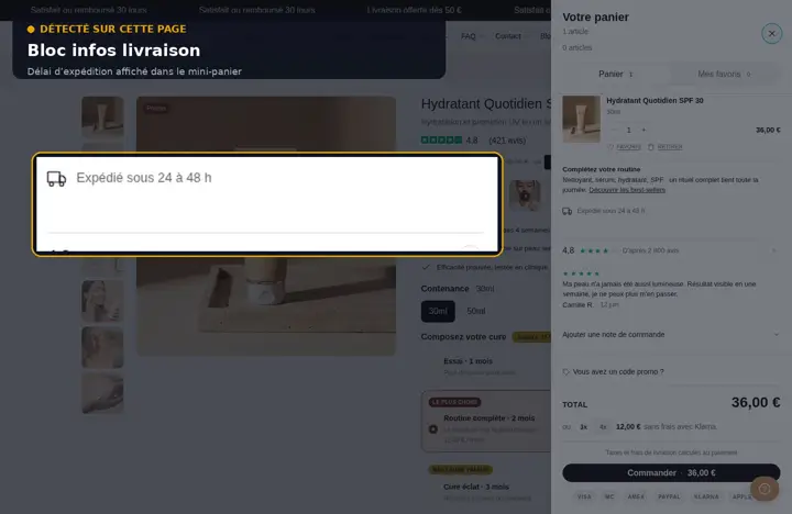 List of shipping methods in the cartYour shipping methods and their prices, written by you, shown in the cart: shoppers know times and costs before they pay.
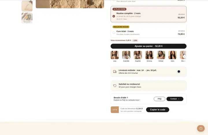 Estimated delivery date by countryThe cart works out a delivery date range (business days) from the shopper's country and your zones: they know when it will arrive.Save 12 €/mo
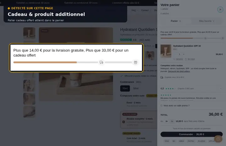 A checkbox for gift wrappingA checkbox in the cart adds the product of your choice in one click: gift wrap, package protection... Unticked, it's removed.Save 9 €/mo
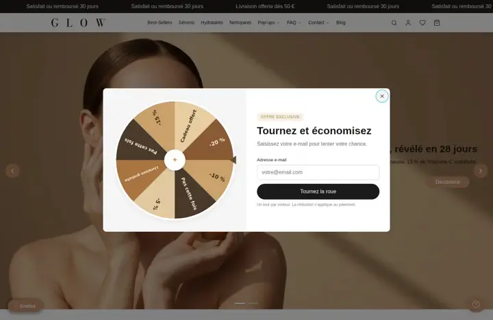 A surprise discount draw in the cartThe shopper clicks, a prize is drawn at random based on your weights and the discount code applies to the cart automatically. One try per order.
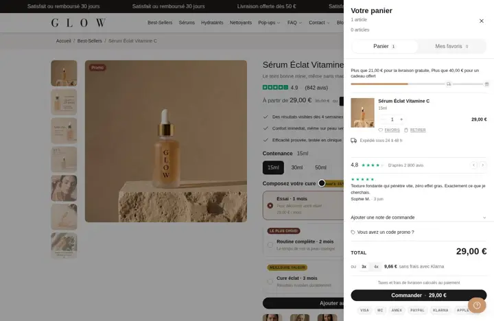 Customer reviews scrolling in the cartAn overall rating and a few reviews scroll in the cart, right before checkout. You choose which reviews to show.
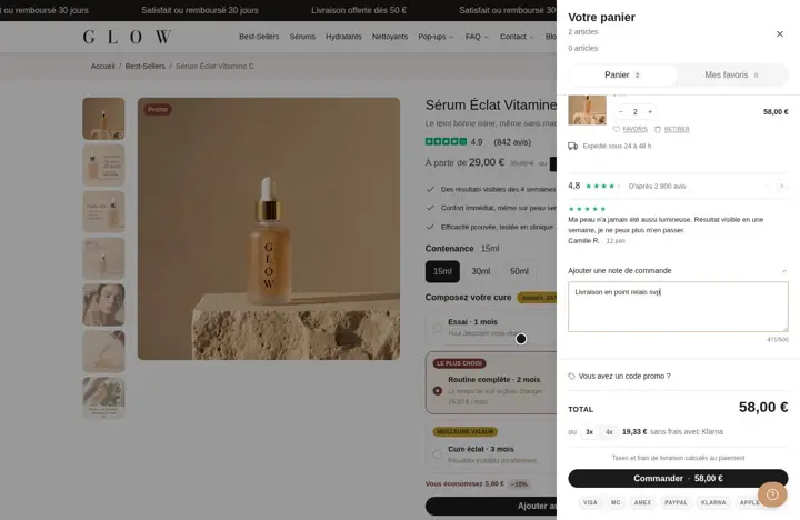 Let customers add a note to their orderThe shopper leaves an instruction (pickup point, gift message) in a collapsible field with a counter. You see it in the order.
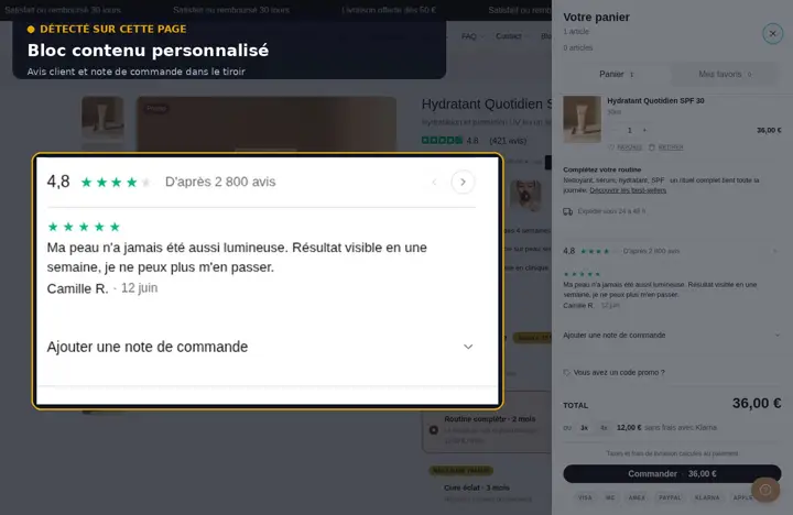 Free text in the cartA text or HTML area to place anywhere in the cart: guarantee reminder, routine tip, link to your best sellers.
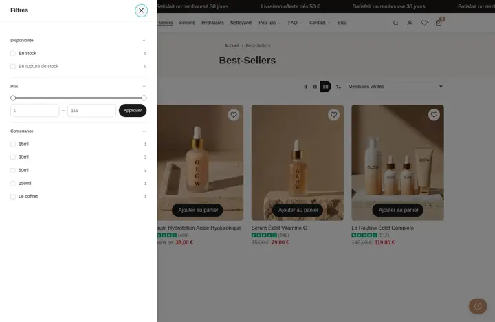 Filters in a column next to the productsFilters stay visible in a column to the left or right of the grid: shoppers filter without opening a menu.
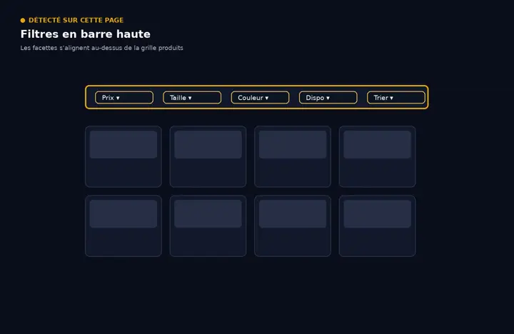 Filters on a bar above the gridFilters line up on a horizontal bar above the products. The grid keeps the full width of the page.
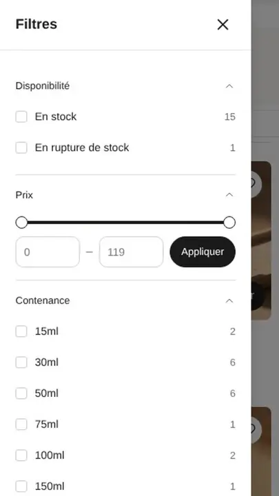 Filters in a sliding drawerA Filters button opens a drawer on the side. The grid takes all the space and the drawer is very handy on mobile.
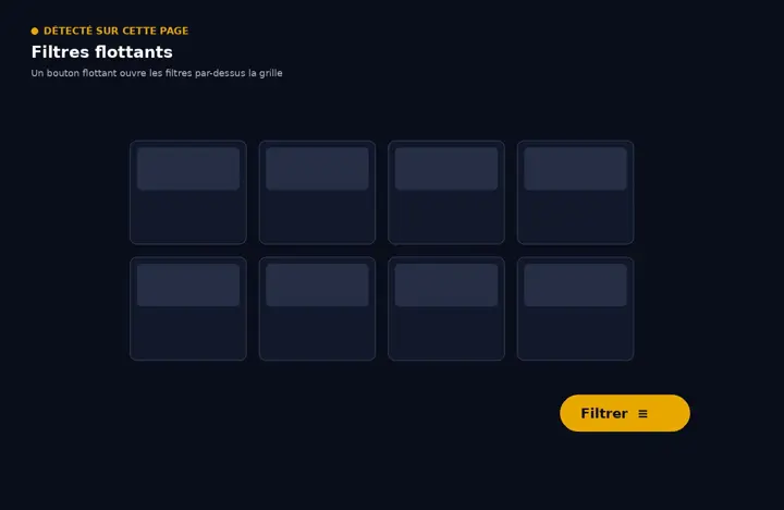 A floating filter buttonA button or filter pills float at the bottom of the screen while scrolling: filters stay within thumb's reach.
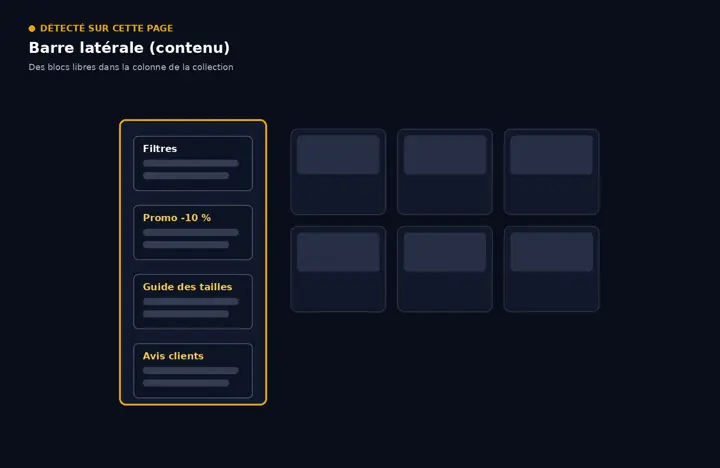 Free content in the filter columnAdd text, an image, a button or trust badges above or below the collection filters, in the same column.
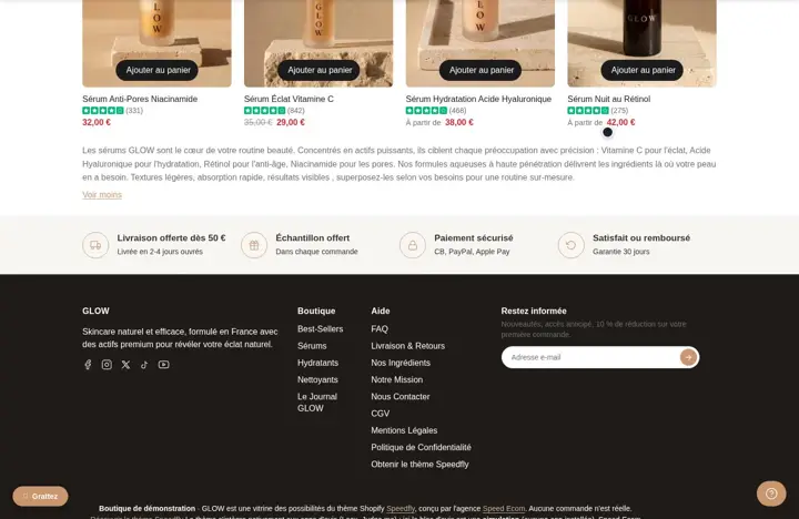 Collection text collapsed with Show moreYour long collection text collapses with a Show more link. You keep your text for Google without pushing the products down.
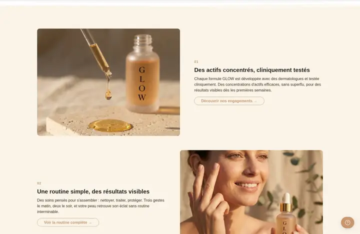 Image with text, side by sideAn image and text side by side to tell your brand story, with optional overlap, a group of 3 images or a color backplate.
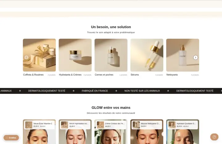
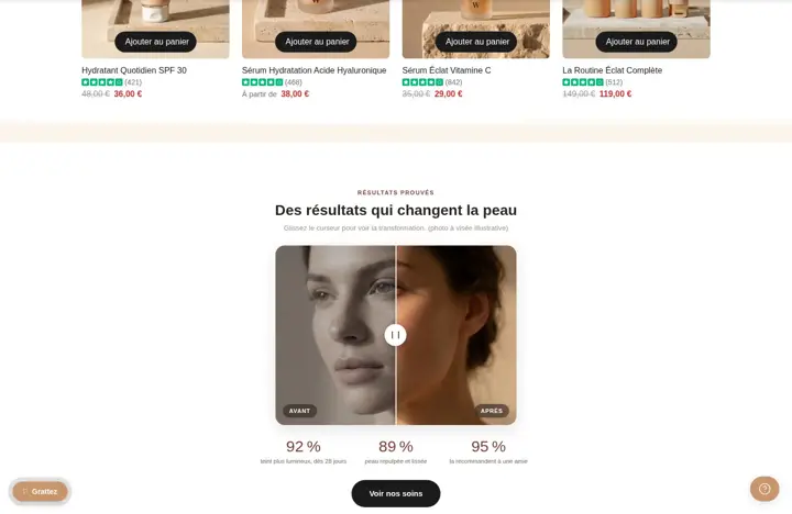
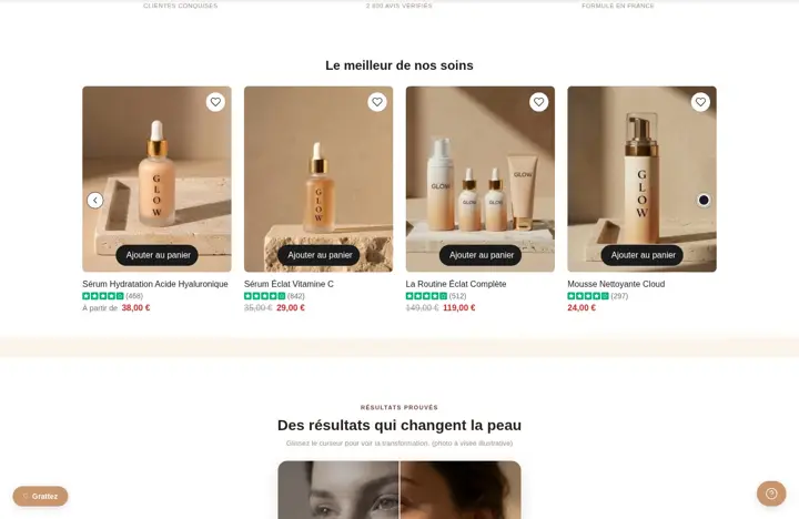 Put a collection in the spotlight on your home pageShows the products of a collection anywhere, as a grid or a carousel, with the same product cards as the rest of your store.
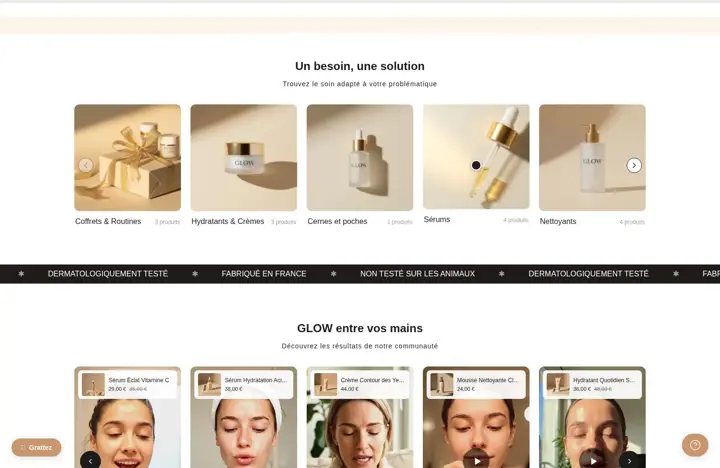 A showcase for your collectionsPresent your collections as cards (grid, mosaic or carousel) so shoppers pick their category right from the home page.
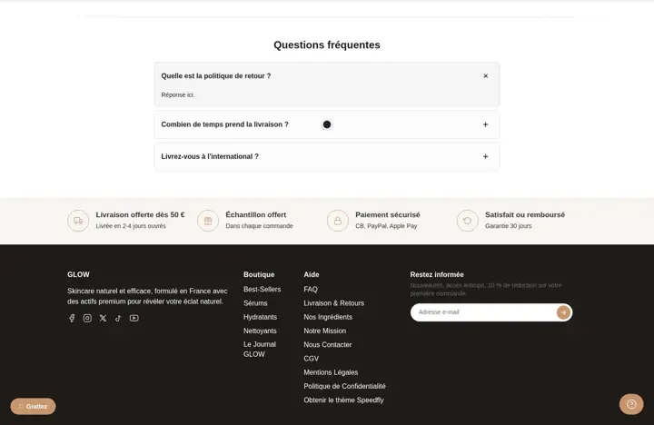 A section of collapsible questionsStack your info as collapsible questions (shipping, returns, guarantees) anywhere on your site, without weighing down the page.
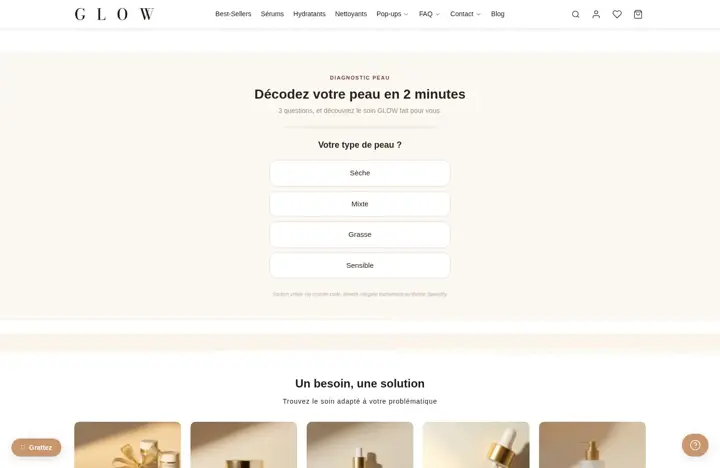 A custom code sectionPaste your own Liquid or HTML into a section to add a widget, a quiz or a script the theme doesn't offer.
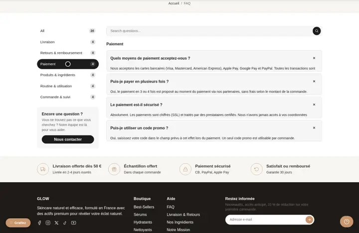 An FAQ sorted by category, with searchYour questions sorted by topic in a column that stays visible, with a search and a button to contact you.
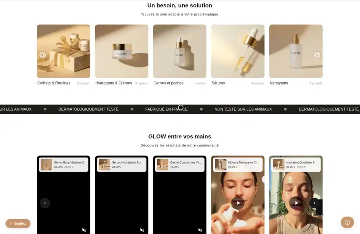 A scrolling banner for your key messagesA banner that loops your selling points, promos or logos. You set the speed, the direction and the separator.
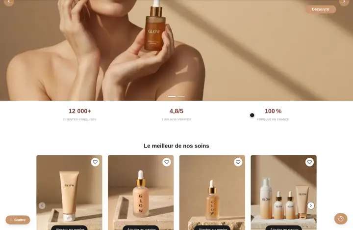 Multi-column: your custom-built gridCreate columns and rows, then drop in the blocks you want. Each column's width is adjustable on desktop and mobile.
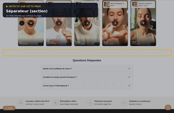 Separator: a line between two sectionsPlace a line between two sections: solid, dashed, dotted, double, fade, wavy, ornamental or dots. Color and width of your choice.
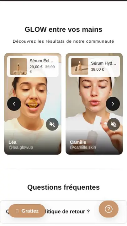 A carousel of vertical videos with productsYour social-format videos in a carousel or grid, each linked to a product, with fullscreen playback on click.
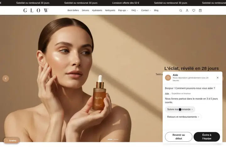 A help widget with ready-made answersA help bubble at the bottom of the screen: the visitor clicks their question, reads your answer, then can write to you through a form.
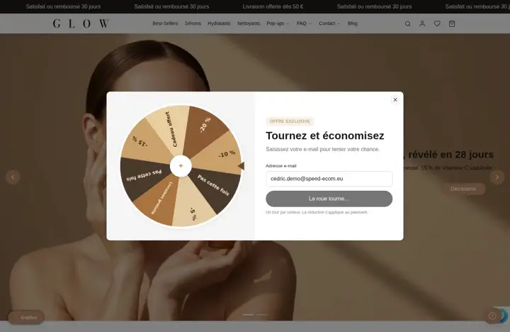 A spin-the-wheel pop-up for emailsThe visitor enters their email, spins the wheel and wins a discount code you chose. Each signup becomes a Shopify customer.Save 12 €/mo
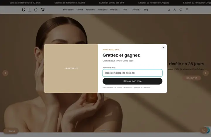 A scratch card pop-up for emailsThe visitor scratches a card with the mouse or a finger to reveal their discount code. You choose whether they give their email before or after.
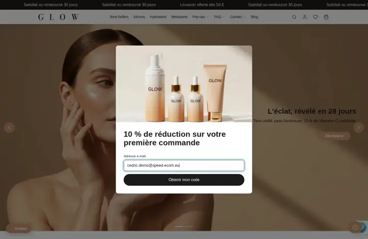 A newsletter pop-up that tags your subscribersOffer a discount for the email at the right moment: after a delay, on scroll, on exit intent or based on cart value.
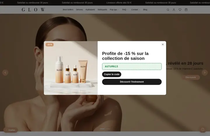 A promo pop-up with a button and a code to copyHighlight an offer or a launch in a pop-up with an image, badge, button and a discount code to copy, without asking for an email.
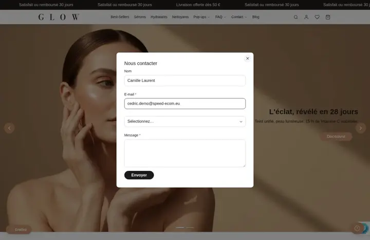 A contact form in a pop-upA contact form that opens over the page from any link. Messages arrive in your store's email inbox.
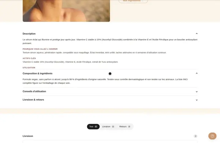 An accordion you can drop anywhereQuestions that open on click, to place in a column or a group. 5 styles, one icon per question, single-open option.
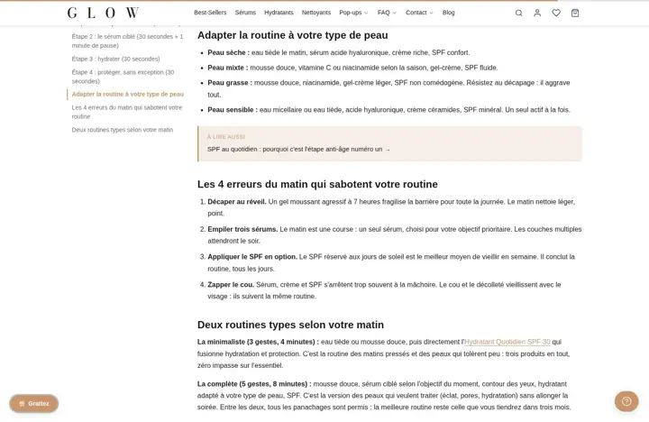 A quote for a review or a promiseHighlight a customer review or a strong line, with the author's name and role. 4 styles: bar, quote mark, top bar, minimal.
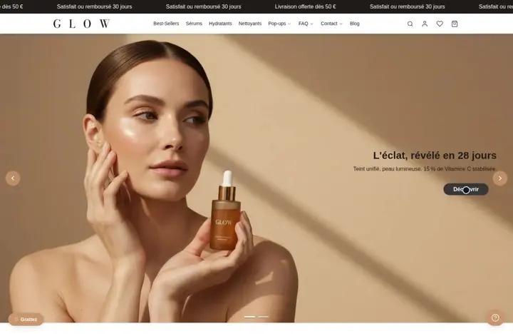 An action button in 3 stylesThe button to place anywhere: solid, outline or plain link, with an icon on the left or right and its own hover colors.
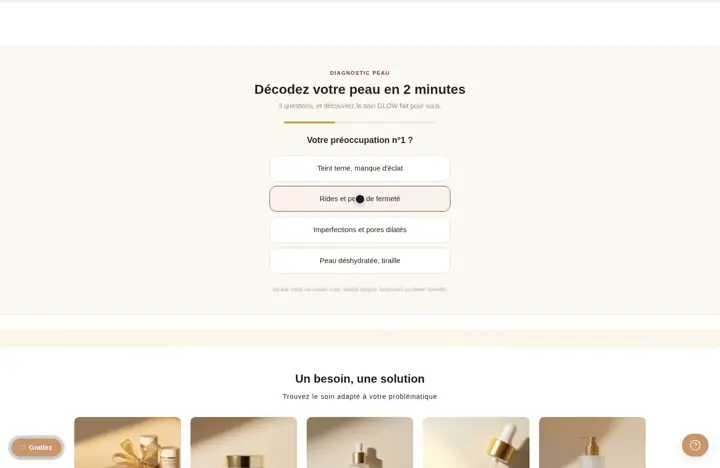 A Code block to embed a widgetPaste HTML or Liquid in the middle of a section: review widget, video, external form. No need to create a separate section.
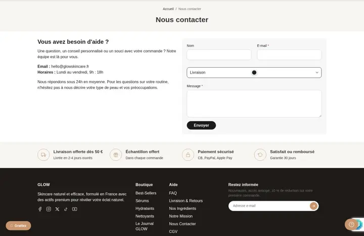 A contact form with your own fieldsBuild your form with 10 field types: dropdown, checkboxes, date, phone... Messages arrive in your store's email inbox.
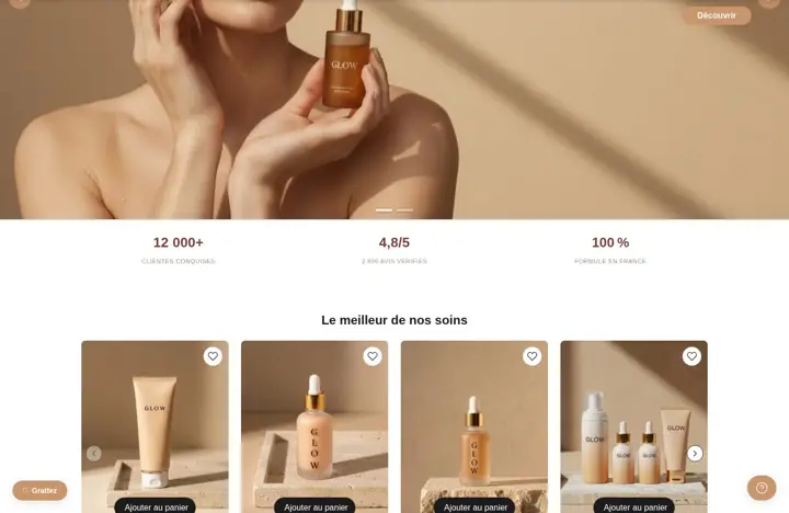 An animated counter for a key figureA number that counts up to your value when it comes on screen, with a unit and text. It stays still if the visitor turns off animations.
 A heading with the right tag, from H1 to H6Your heading with the tag of your choice, from H1 to H6, for a well-structured page. Size, font and color adjustable per device.
 A subheading to go with a headingA short line below or above a heading, with its own font, size and color, adjustable on desktop and on mobile.
 Formatted text for your contentThe paragraph block with bold, italic, links and lists. Font, size, link color and italic color are adjustable.
 A standalone icon, with or without a framePick an icon from 62, with no frame, outlined or on a solid background. Size, color and link are adjustable.
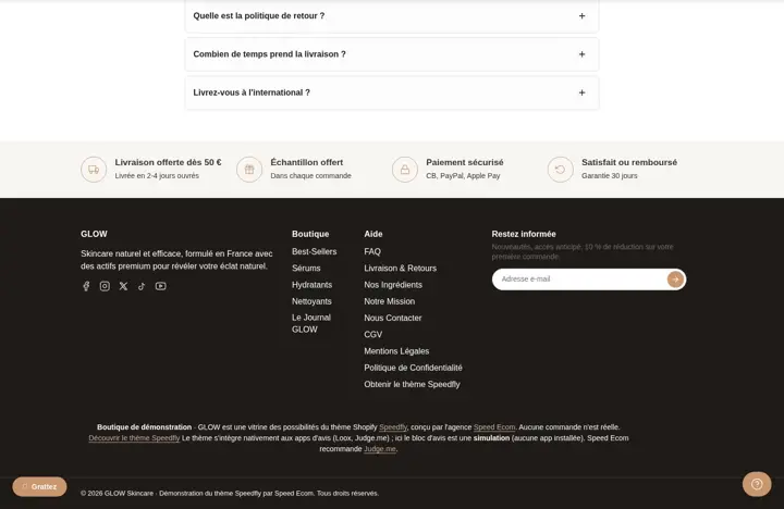
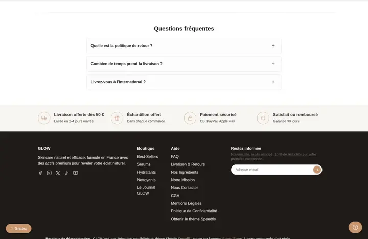 Trust points with an iconShipping, returns, secure payment: an icon or a small image, a title and a line of text, side by side or stacked.
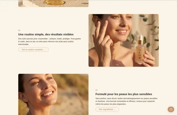 An image with a mobile versionAdd an image wherever you want, with a different image for mobile if you want another crop. Format, corner radius and link of your choice.
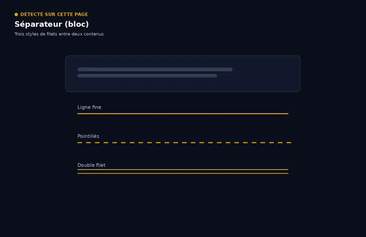 A separator to drop between two blocksThe same line as the Separator section, to place between two blocks in a column or a group. 8 styles to choose from.
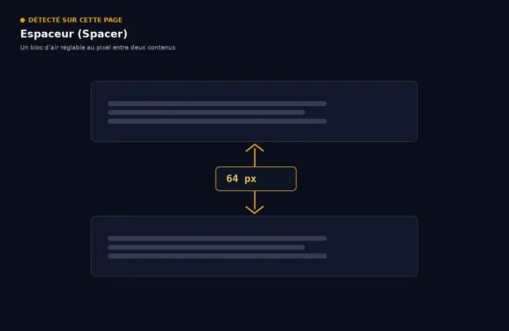 Adjustable empty space between two blocksAdd some air between two blocks, with a different height on desktop and on mobile. Can be hidden on either one.
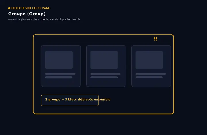 Group: keep several blocks togetherPut blocks side by side or one below the other in a single frame, with background, border and margins. A group can contain another one.
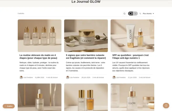 Blog as a grid or a list, your choiceShow your articles as a grid or a list, and let visitors switch views in one click. Sorting, search and loading of your choice.
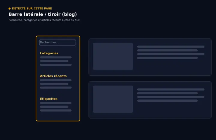 A sidebar or drawer for your blogAdd a column next to the articles, fixed or as a drawer, and fill it with theme blocks: text, image, button, form...
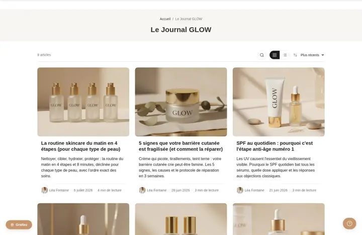 A featured article at the top of the blogChoose the article to push with a tag: it shows large above the list, on the first page of the blog.
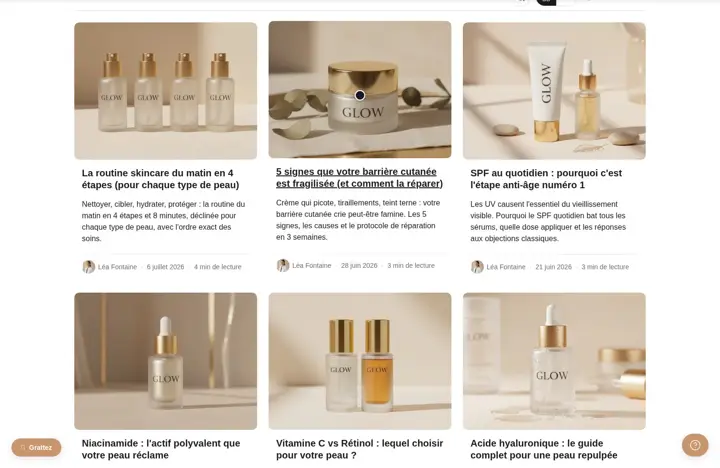 3 card styles for your articlesStandard, overlay or minimal: choose how your blog cards look, then set image, badge, author, date and read time.
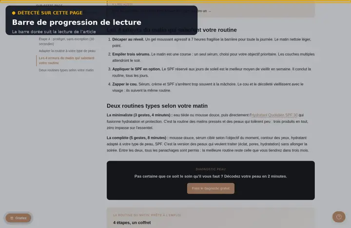 A bar that tracks reading progressA thin bar at the top of the screen fills up as your reader moves through the article: they always know where they are.
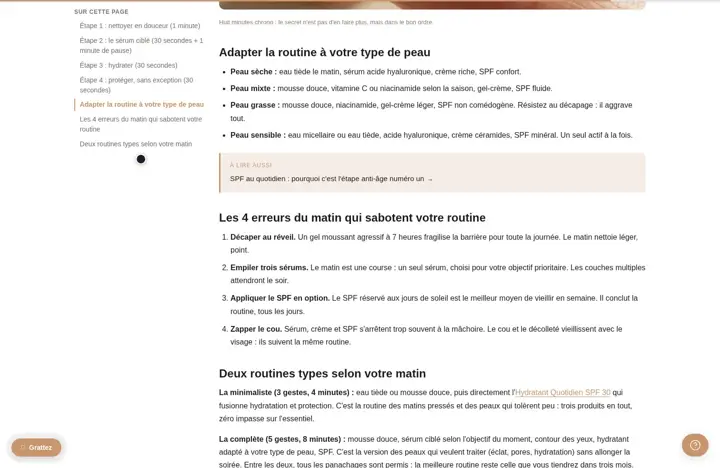 A table of contents built automaticallyThe table of contents is built from your article's headings, next to the text or above it, and highlights the part being read.
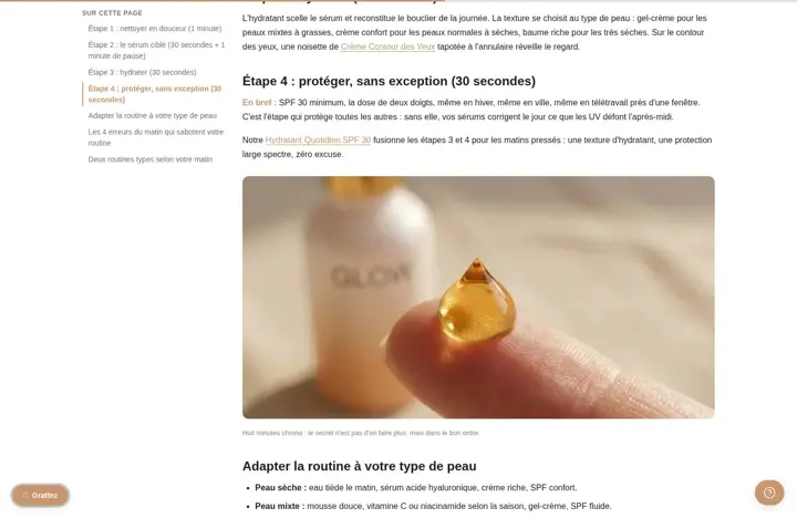 A side column in your articlesAdd a fixed column or a drawer next to the text: table of contents, text, image or button, on the left or right.
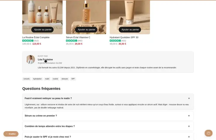 An author box under the articlePhoto, name, role, bio and links of the author at the end of the article: your reader knows who is talking to them.
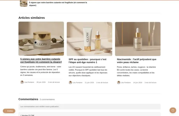 Articles to read nextAt the end of the article, suggest more reading: same tags, your own selection, or the latest blog articles.
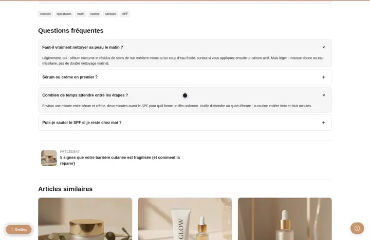 An FAQ specific to each articleAdd your readers' questions at the bottom of the article, as an accordion, from a metafield: each article has its own FAQ.
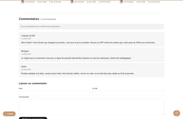 Clean, styled comments under your articlesShopify comments styled as cards or in an editorial style, with a form and a moderation notice.
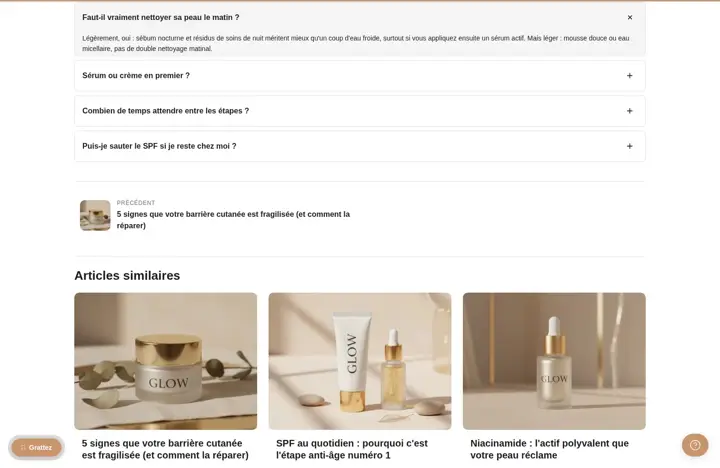 Move readers from one article to the nextAt the bottom of each article, two links with a thumbnail to the article before and the one after: your reader keeps going without returning to the blog.
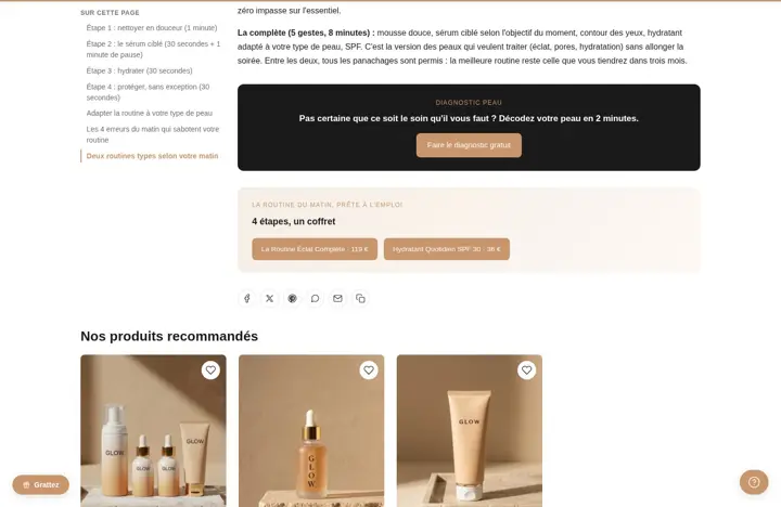 Clickable tags and share buttonsShows the article's tags and buttons to share it on Facebook, X, Pinterest, WhatsApp, by email or by copying the link.
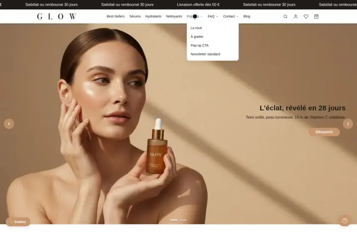 A header you build block by blockLogo, menu, search, account, wishlist, cart, text or button: each element is a block you place in the column of your choice.
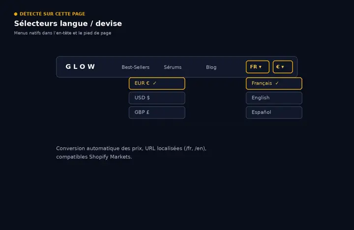 Language and currency selectorsAdd a language and country (currency) selector to the header or footer, connected to Shopify Markets.
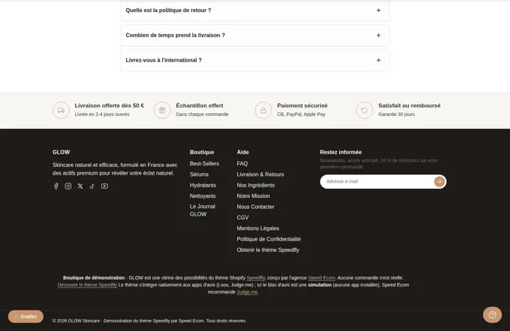 A modular footerText, menus, newsletter, social media, payment methods, image, button: build your footer in columns, the way you want.
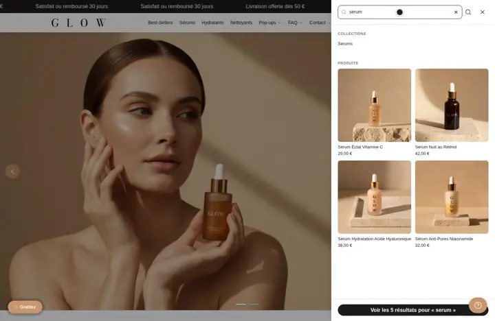 Results from the very first letterYour shopper types in the search and instantly sees products, collections and articles, with photo and price.
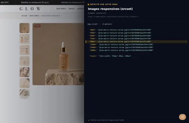 Images at the right size on every screenEach image exists in several sizes: the phone loads the small one, the wide screen the large one, and the top image loads first.
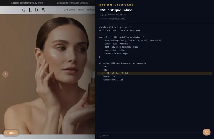 The page shows up styled right awayThe essential styles for the top of the page are built into the page, and design variables are defined only once.
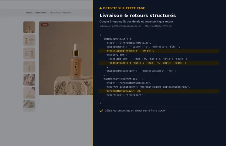 Shipping and returns that Google can readEnter your delivery times, shipping rate and return policy once: they're added to the product data read by Google.
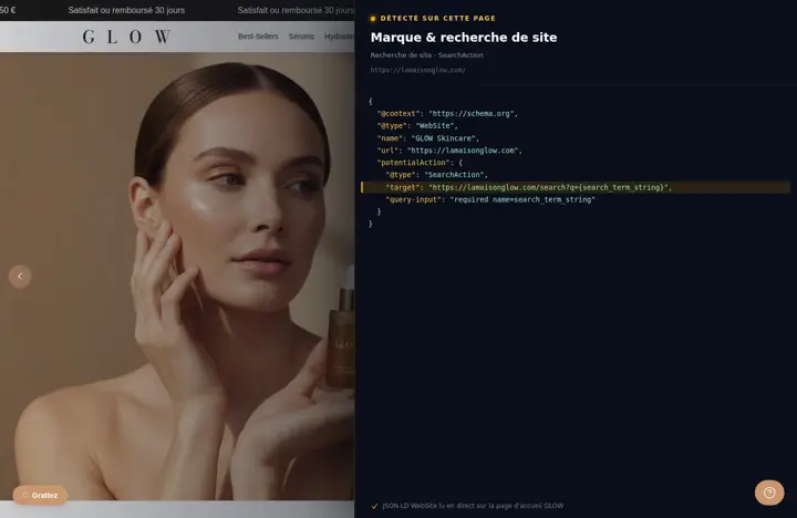 Your brand identity described for GoogleYour store's name, logo, description, contact, address and social media sent to search engines in a format they understand.
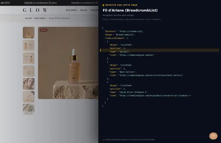 A breadcrumb that Google understandsThe Home > Collection > Product path shows on your page, and Google can show it instead of the URL on desktop.
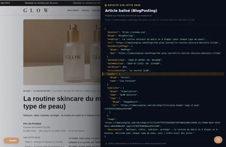 Your articles described as articlesEach article sends Google its title, author, dates, image and description in the BlogPosting format.
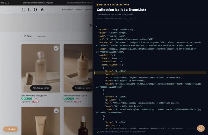 Your collections described for GoogleEach collection page states its name, its description and the ordered list of its products, in a format search engines read.
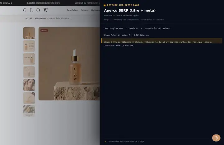 The title and description seen in GoogleChoose the separator, add your store name or not, and give a fallback description to pages that don't have one.
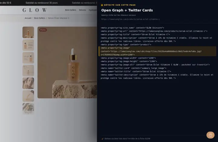 Good-looking previews when your links are sharedA clean image, title and description when a link to your store is shared on social media or in a messaging app.
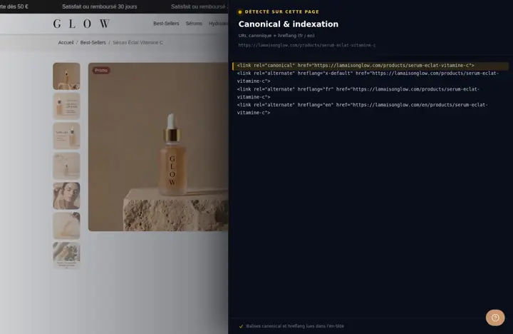 You choose what Google indexesPages with no value (search, cart, tags, account) are kept out of Google, and you verify your site in one field.
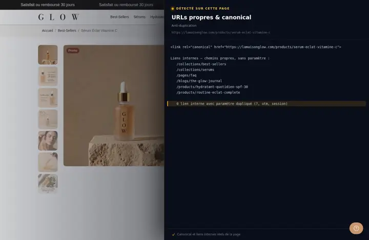 Short product links with no duplicatesYour product cards always lead to the product's short URL, so the same product page doesn't exist under several URLs.
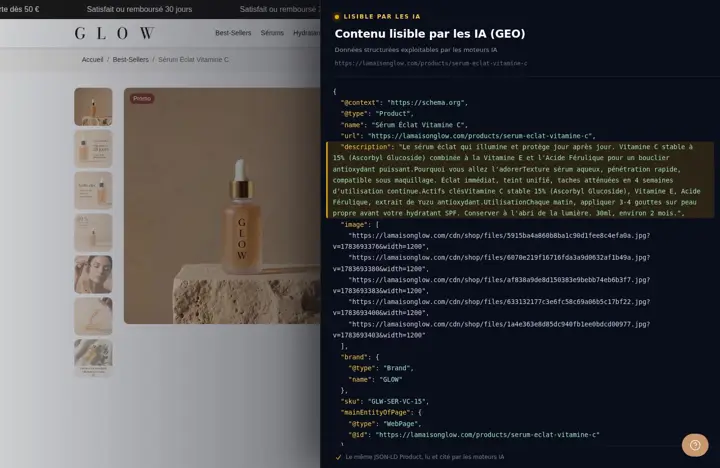 A clean technical base for Google and AIStructured data, clean titles and tags: your products and brand are described in a readable way for search engines and AI assistants.
Your store deserves better than an empty theme.
Try Speedfly for 14 days on your real store. Not convinced? Cancel in one click.